
The MSK Design System supports digital products made for consumers like patients and specialized healthcare staff alike
Challenge
Build a design system that meets the needs of designers and developers working on products for users with vastly different needs
Solutions
• Headless design system with semantic tokens
• Pro and Consumer modes
Roles
Visual and interaction design, front-end development (presentational CSS/SCSS)
Team
Design System Team (part of UX)

Early Days
The MSK Design System started as a modification of the IBM's Carbon Design System available in Figma and code packages.
This worked for some time, but our designers soon realized that what worked for more accessible consumer-facing apps didn't work so well for clinical staff who needed a lot of density.
As a result, we had to split our system into two type styles: Gotham in big sizes for consumers, and Source Sans Pro in little sizes for staff.
Tokens
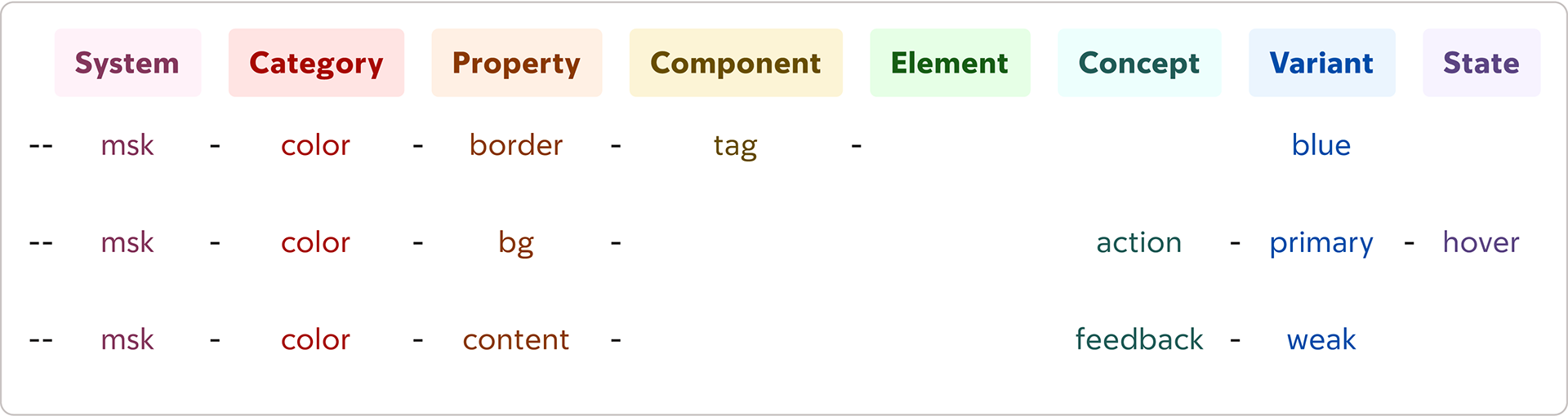
Semantic tokens were created and taxonomized for ease of use
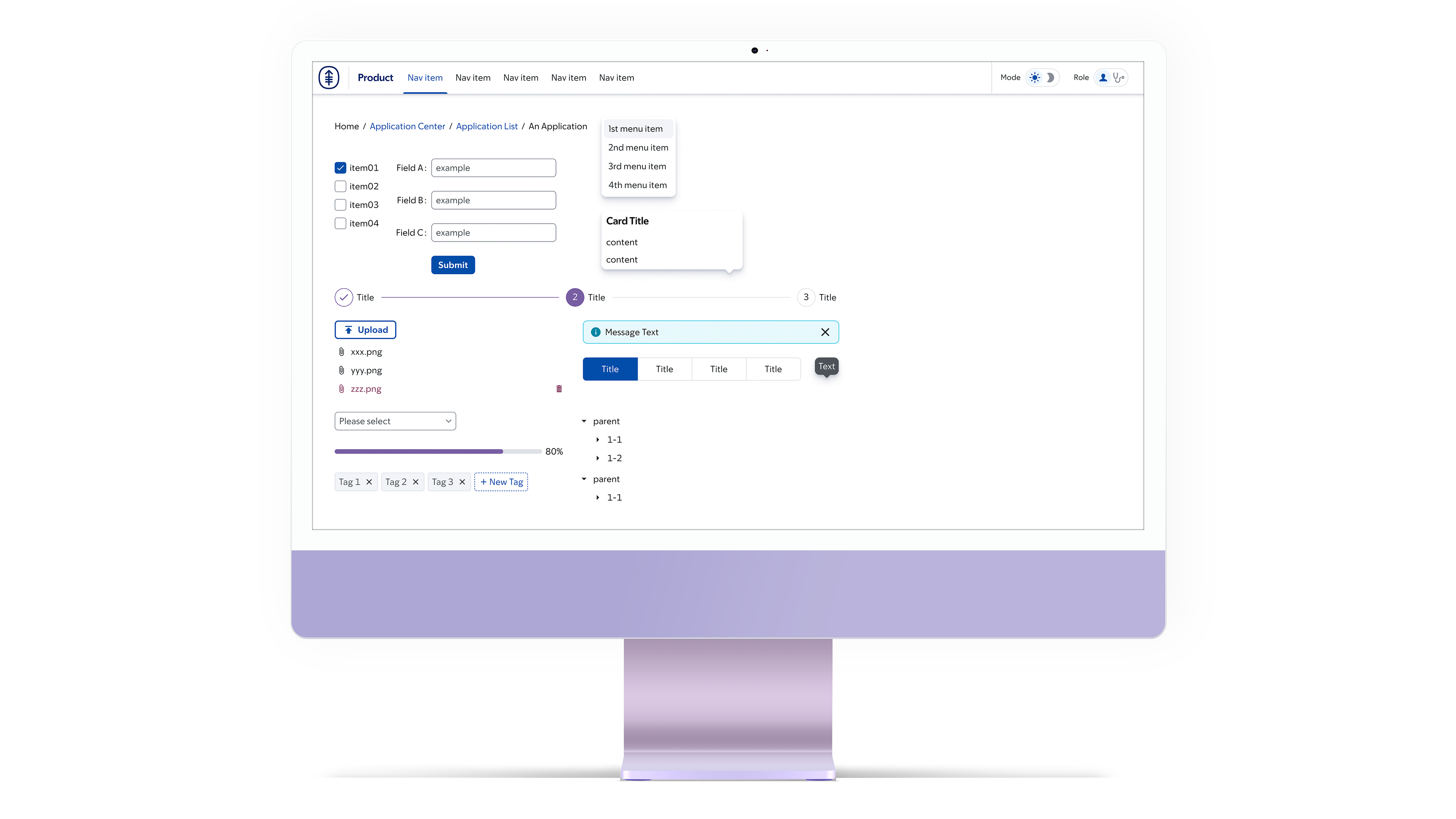
Tokens also allowed us to introduce light and dark modes to the system.


Going Headless
The MSK Design System outgrew Carbon and evolved into a headless design system able to theme different technologies such as Ant Design, Gradio, and Flutter.
Two of the greatest changes were:
• The adoption of MSK Sans font, MSK's new proprietary typestyle
• Size, space, and typography tokens that allowed a consumer and pro roles (functioning like modes) with different densities and sizes for different audiences

Toggling between light/dark mode and consumer/pro roles