
Mass Times helps Catholics find the times and locations of Masses and other worship services. They keep a crowdsourced database of parish info/schedules and are sustained by donations.
Problems
• Finding worship service times was time-consuming and difficult
• The accuracy of parish info was not trustworthy
• Users couldn't get a sense of the qualities of a parish before visiting
• The UI seemed unappealing and confusing at times
Solutions
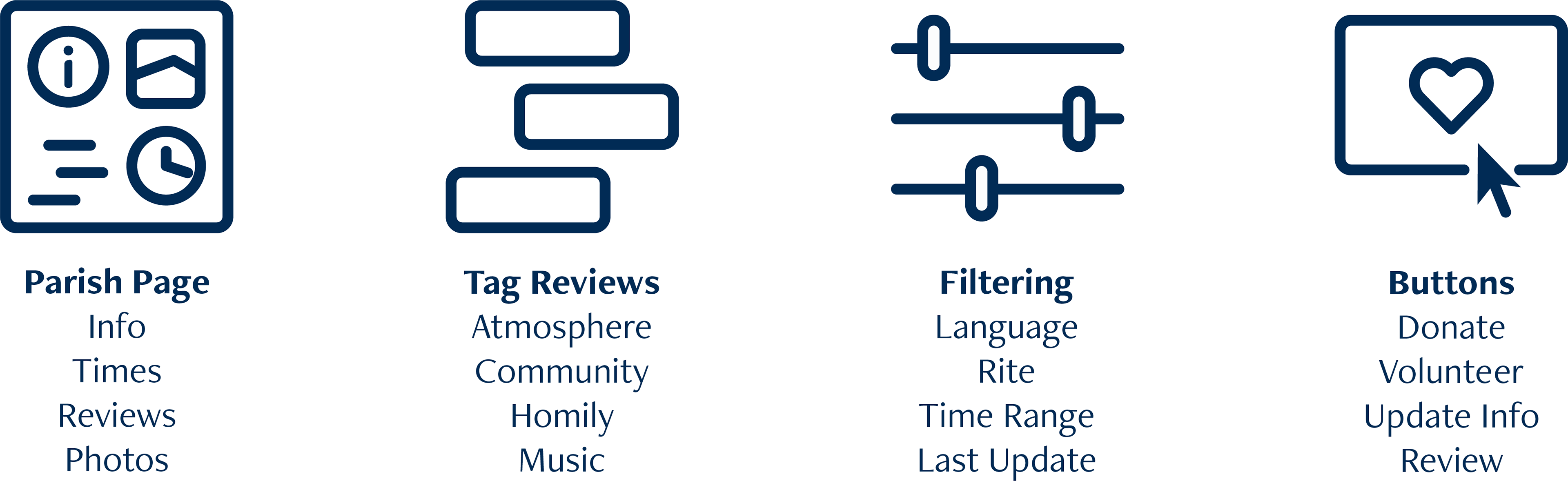
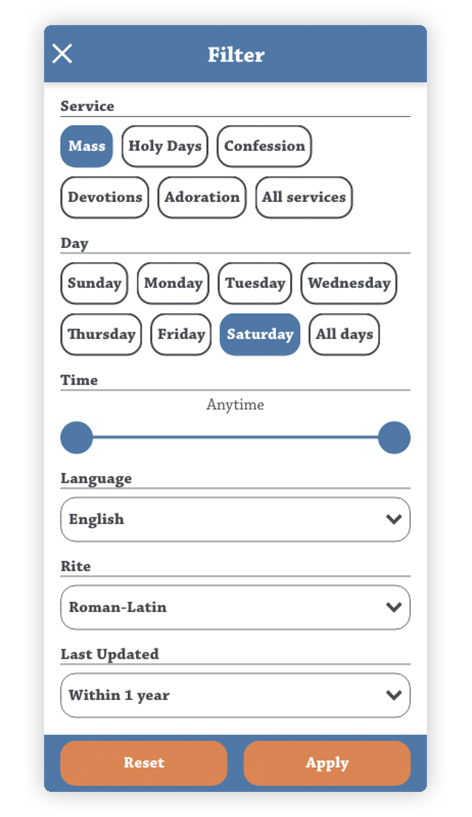
• Additional options for filtering/sorting
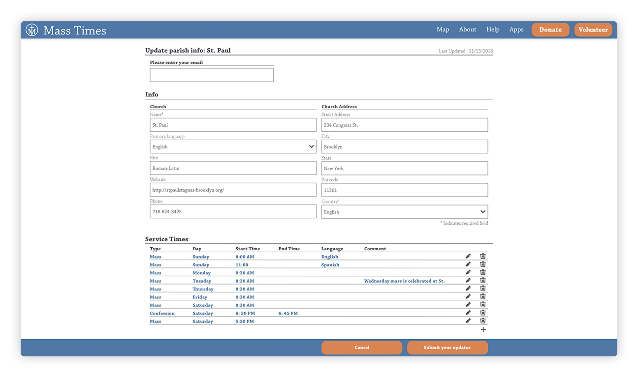
• Channels for adding/updating parish information were made prominent and simple
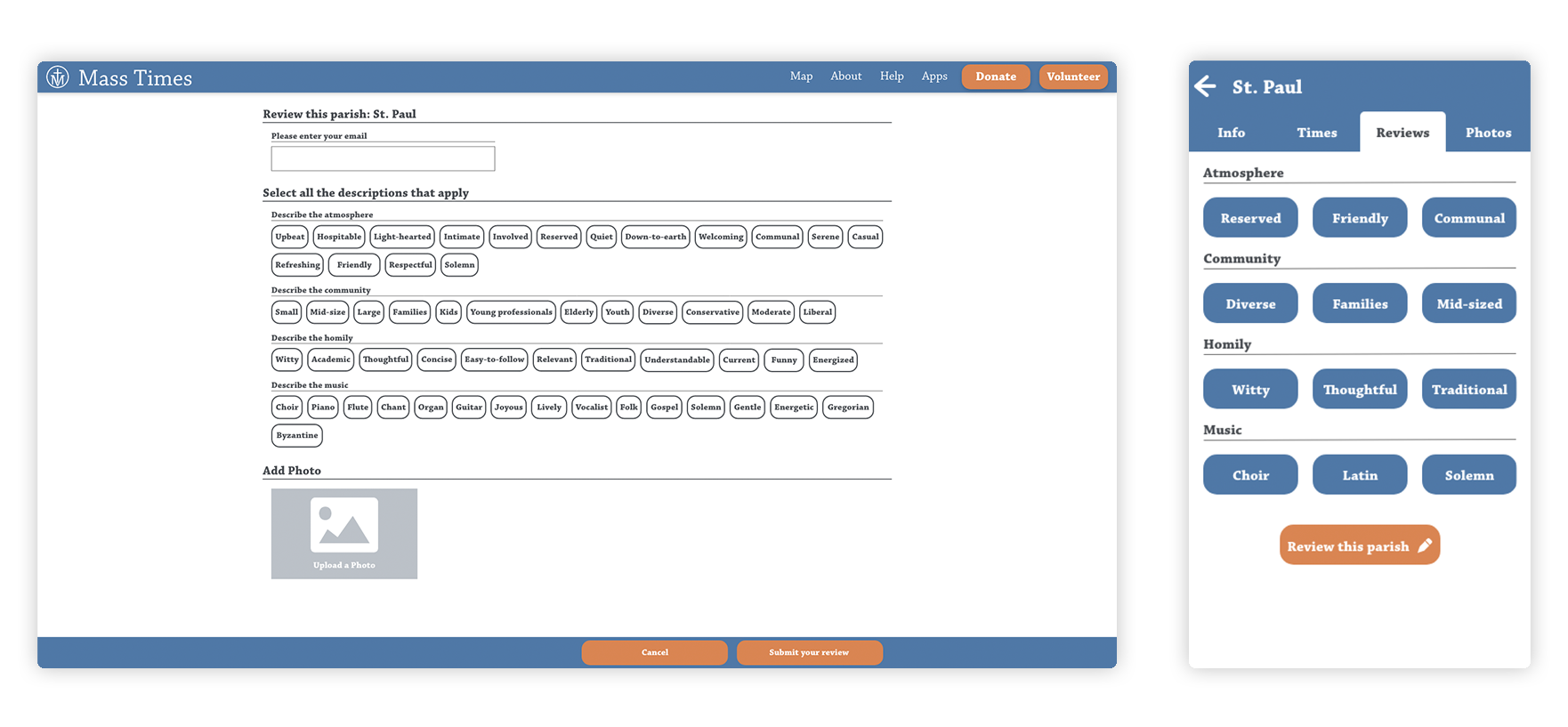
• Tag-review system and photos in parish info pages
• Visual/UI design for currentness, clarity, and legibility
My Roles
Survey, Interviews, Wireframing, UI Design, Logo Design, Prototyping

Research
I set out to validate my assumptions that the process of searching/sorting through results was lacking and that parish information was often dated/inaccurate.
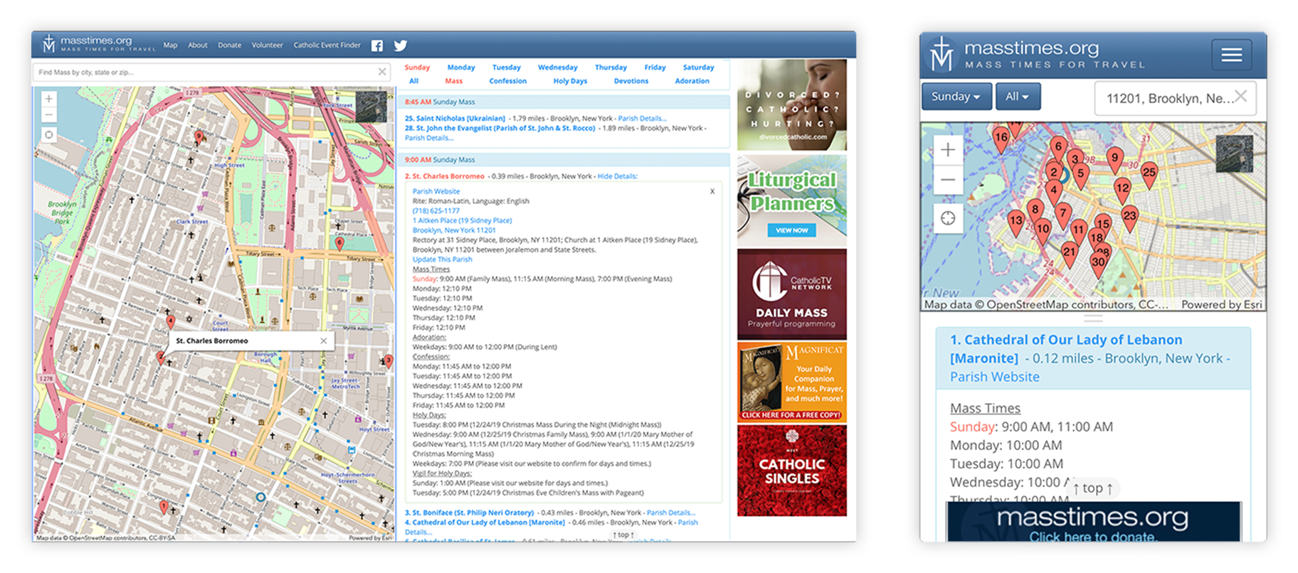
Original sites
Survey
A survey was sent out to gather information about site usage, users's experiences, and opinions.
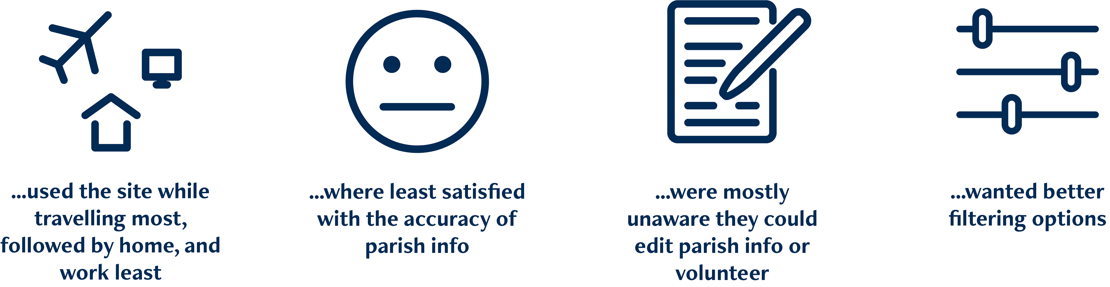
Users...
Interviews and Affinity Diagram
I set out to learn the contexts and situations in which the site and its alternatives are used. Another focus was gathering pain points in the search process on-site and off-site.
The survey and interview results were collected into a single affinity diagram.
Pain points pertaining to Mass Times
• Lack of sorting/filtering options
• Results were hard to read and time-consuming to browse
• UI/visual design described as confusing, unpleasant, dated, or unfamiliar
• Info often missing/incorrect and users felt they had to verify accuracy
• Info often missing/incorrect and users felt they had to verify accuracy
• No indication of last update to info
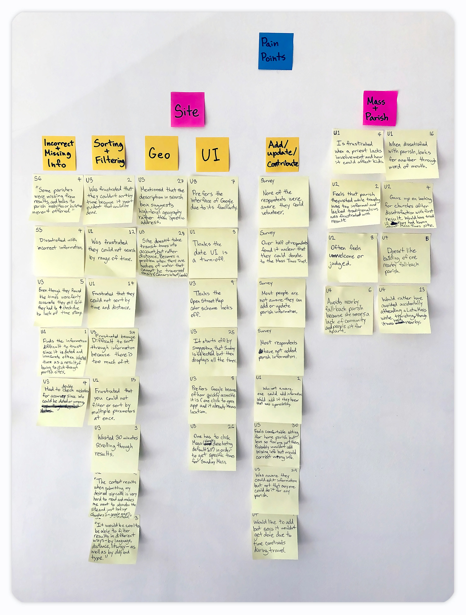
Interviewees spent a lot of time describing what qualities they liked or didn't like in a Mass or parish. An unexpected set of pain points was uncovered.
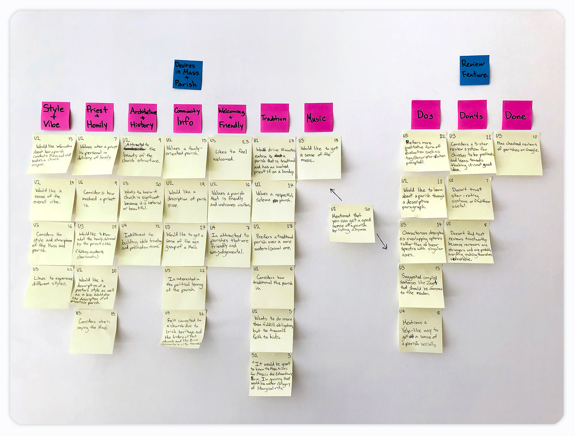
General pain points
• Limited ways to get a better sense of what a parish was like
• Difficulty in finding parishes that match individual preferences
• Having a bad experience while visiting a parish
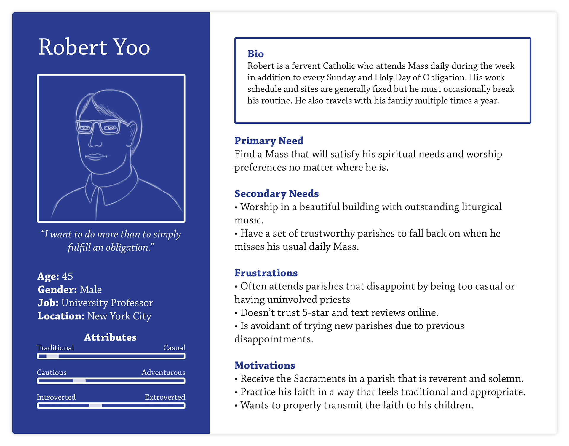
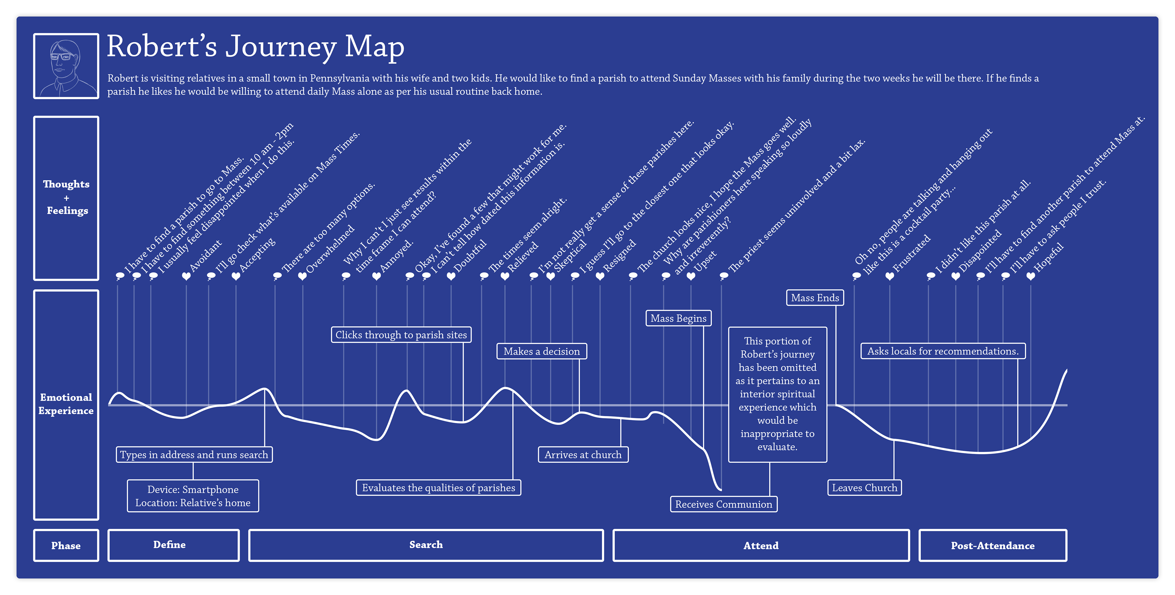
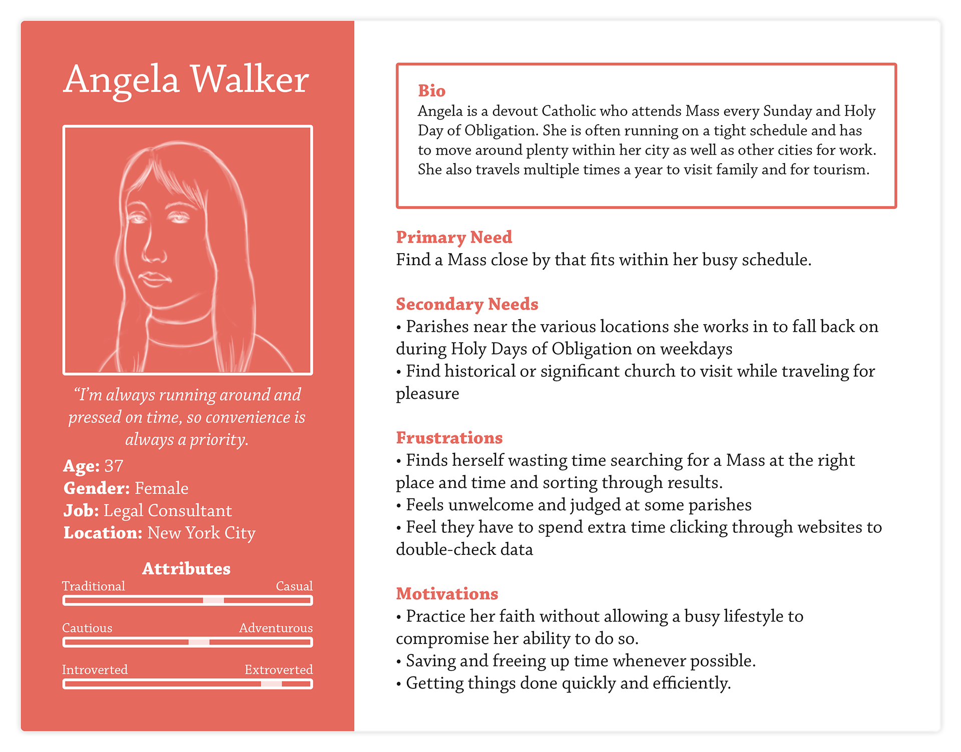
Persona and User Journeys
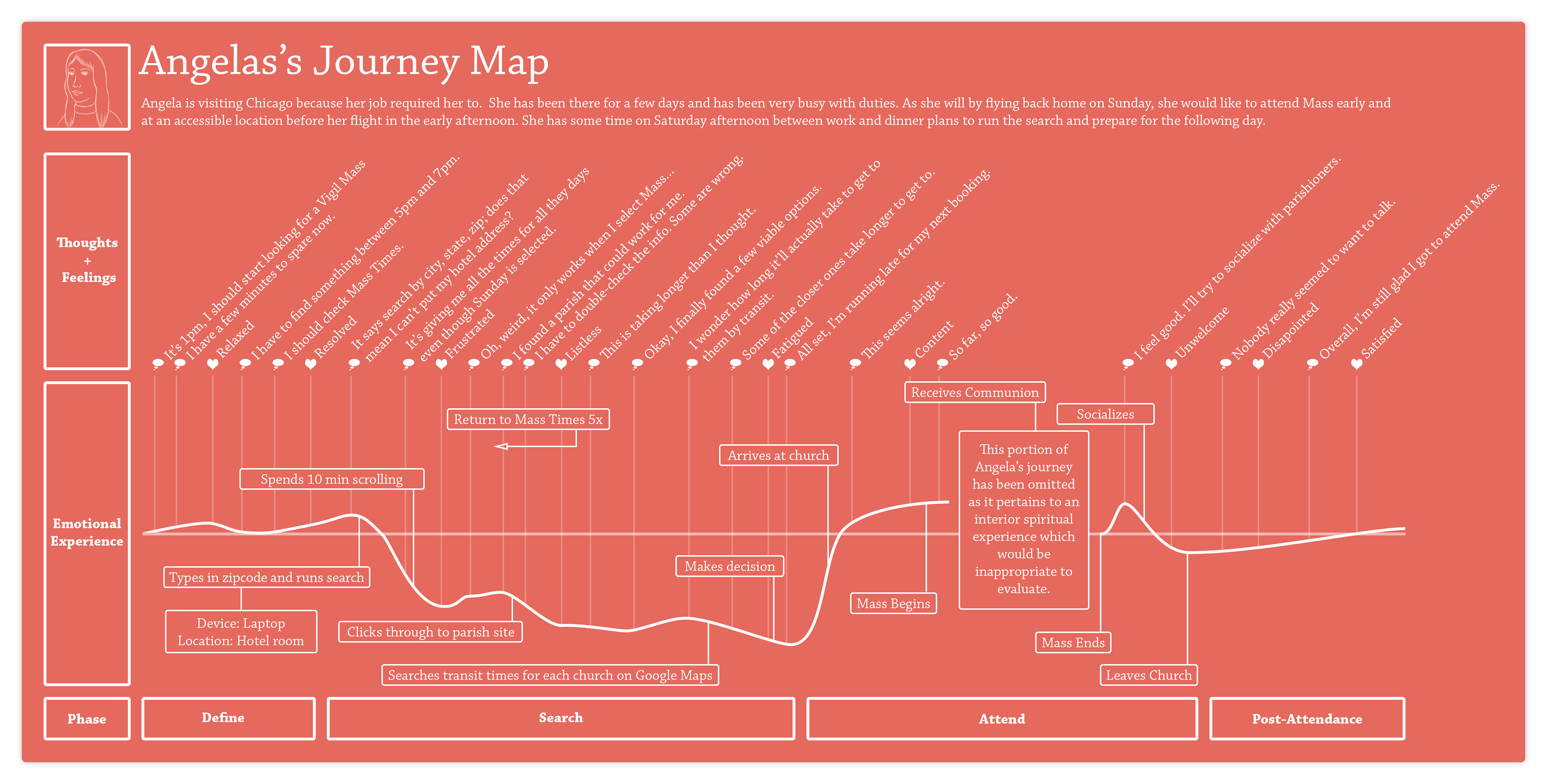
Two priorities emerged: the desire for specific qualities and convenience. These were translated into distinct personas with respective journey maps.
Quality-oriented Robert
Convenience-oriented Angela

Design
With user types in mind, I set out to optimize the site for convenience and to help users select a parish they would feel comfortable visiting.
Ideation
Significant features:
A Word on Reviews:
In line with user feedback, a review system employing preset tags* was developed. These made for a qualitative overview of a parish with a low abuse potential.
*Inspired by the Leafly website
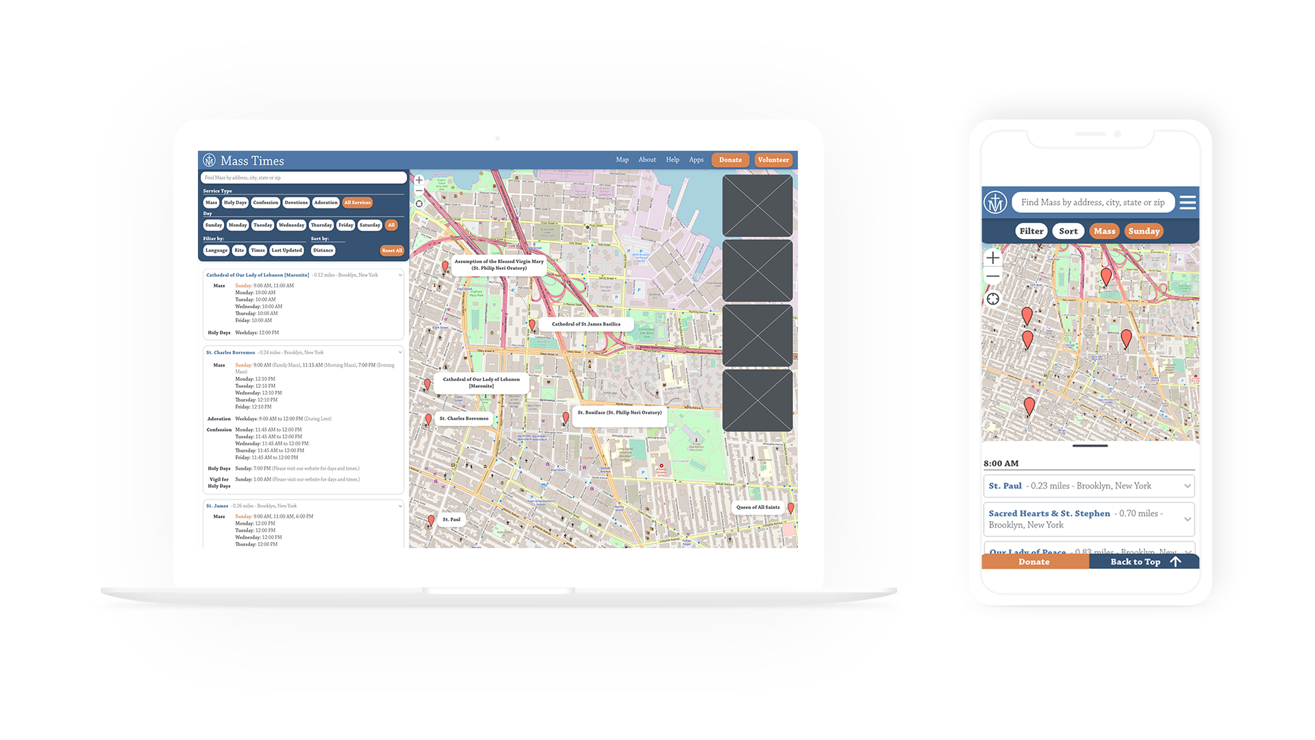
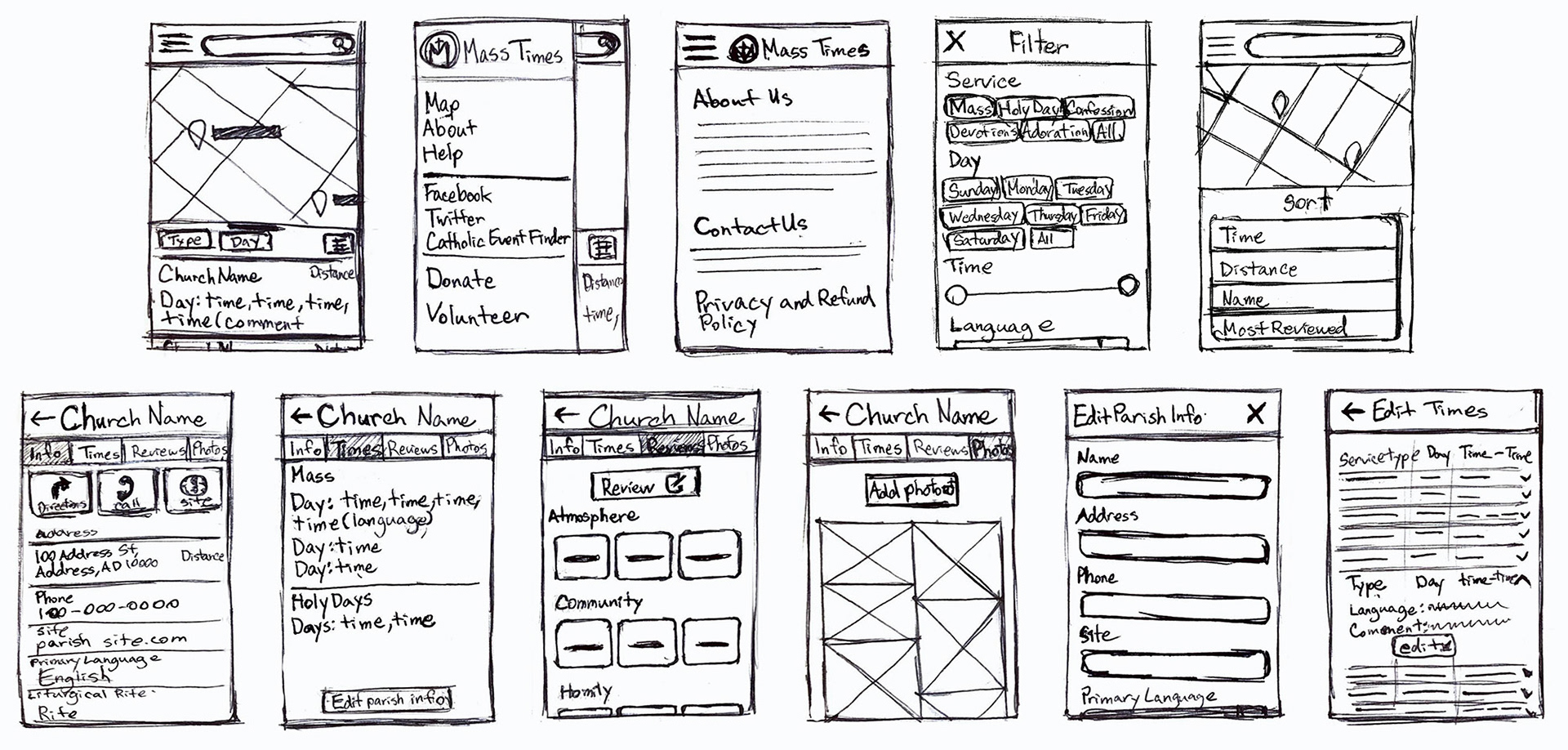
Wireframes and Prototypes
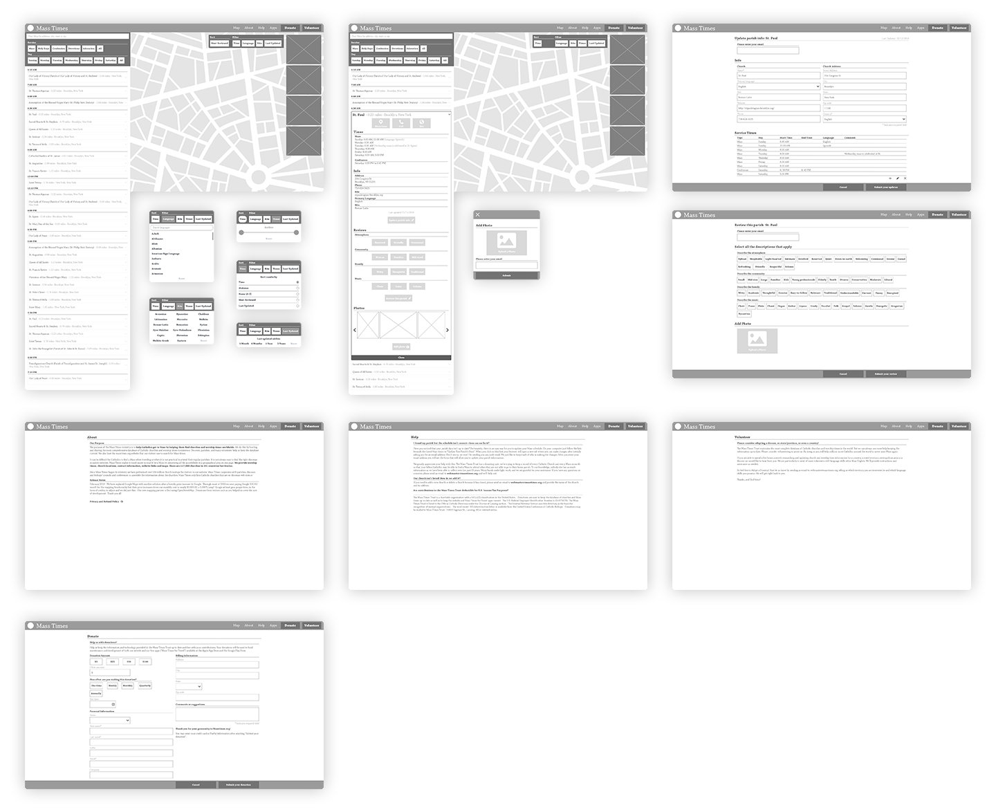
Given user feedback, I wanted to test prototypes with the UI and visual design already developed.
User Testing
User tests mostly revealed flaws in the desktop design, though both sites suffered in a lack of contrast and legibility.
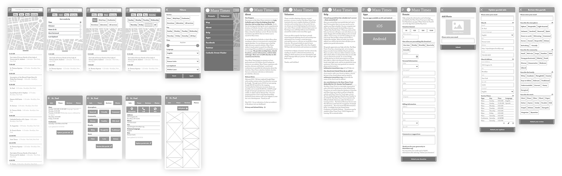
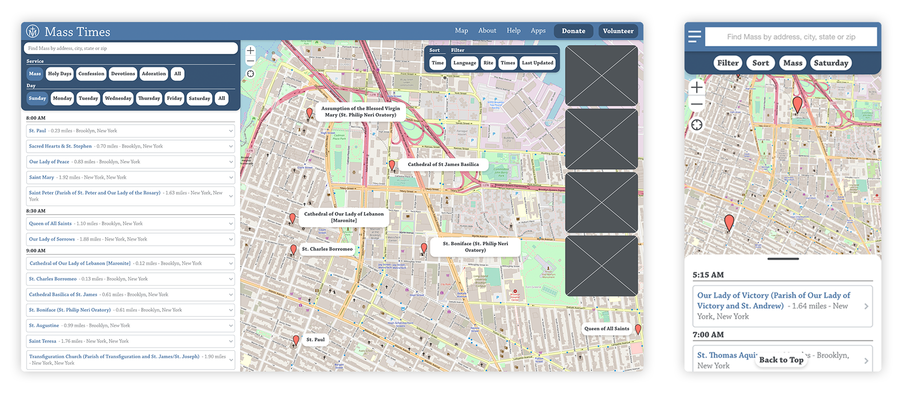
Final Prototypes
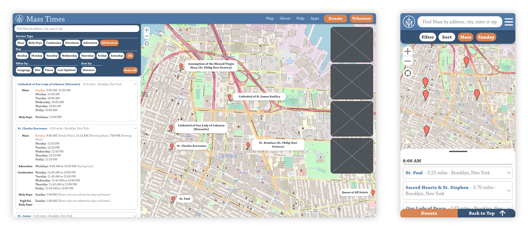
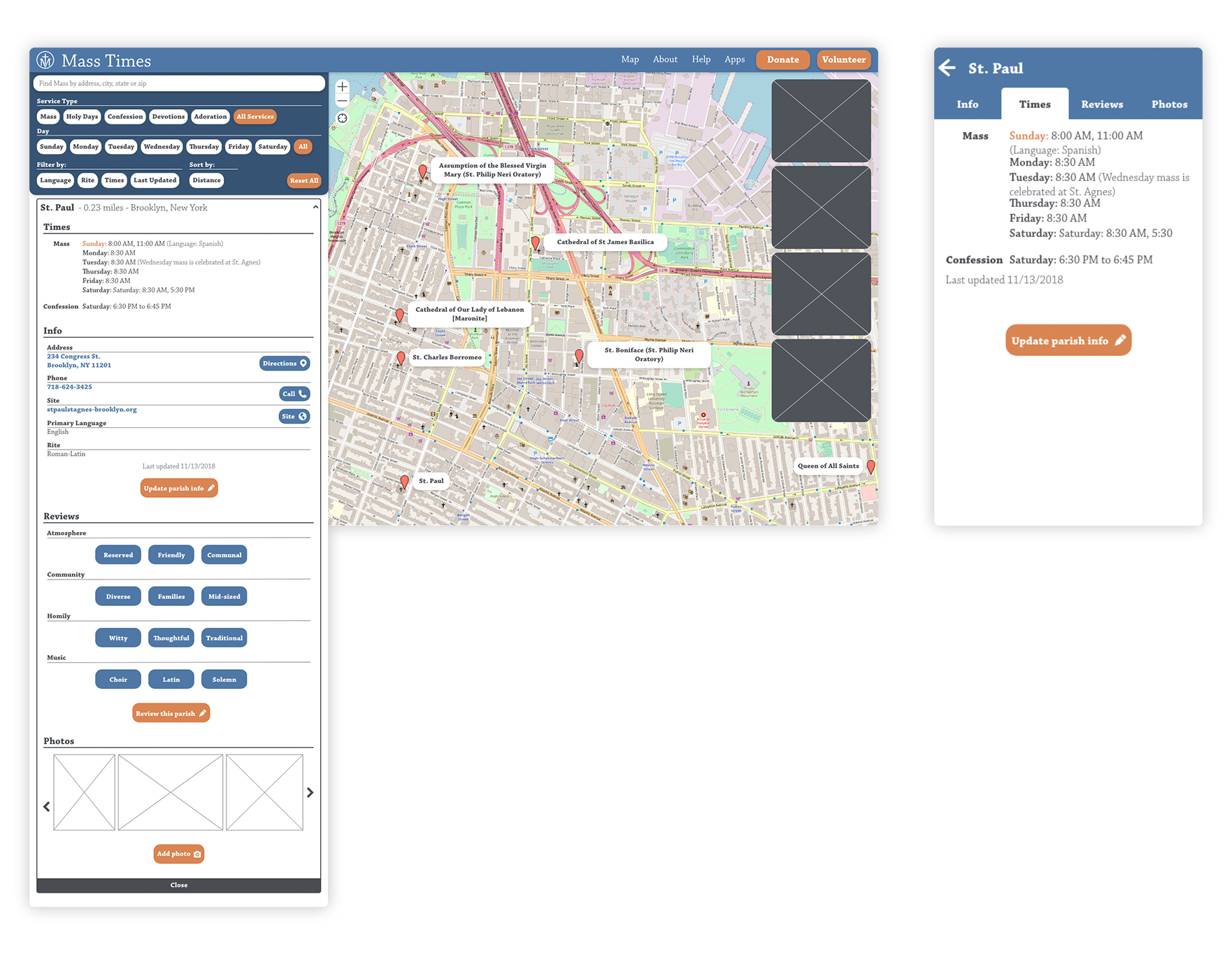
Notes on visual design
• Reflect a contemporary visual experience
• Logo, colors, and typography refreshed for currency
• Layout and visual hierarchy of results were modified for clarity and legibility
Final Thoughts
The design was shared with the Mass Times Trust and they implemented aspects of it. If I had been able to test with a large number of users, I would do some card sorting in order to refine the review tags.